Today we're very happy to announce that our book Thinking in SwiftUI is updated for iOS 17, and available in both PDF as well as print.
After releasing the previous edition we have held a large number of workshops and gained a lot more experience with both SwiftUI itself as well as teaching the material. Because of this, we decided to rewrite the book from scratch.
The new book contains better explanations, and a lot more visuals, diagrams, and examples. During the writing of this new edition iOS 17 came out, which brought a lot of updates to SwiftUI. We decided to include all the relevant changes (clearly marked as such for those of us that have to support older platforms).
We explicitly set out with the goal of not trying to cover every possible API in SwiftUI. Instead, we focus on the fundamental principles behind SwiftUI. We start with explaining how SwiftUI views construct render trees. These trees are essential to understanding the other fundamental concepts: layout, state, animations and the environment.
Until now we have updated all of our books for free ever since we started objc.io (over ten years ago!). Since this update of Thinking in SwiftUI is not an incremental one, but a complete rewrite from the ground up, we've decided to release it as a new product.
We hope you'll enjoy the new version! You can find a PDF preview here.
During the last months, we have worked hard at updating our book Thinking in SwiftUI. Over the past years, we had the chance to conduct SwiftUI workshops for many companies. Based on this experience and the feedback we got, our approach to explaining SwiftUI has evolved a lot. Therefore, we chose to do a full rewrite of the book to be on par with our workshops.
The general structure still is very similar to the previous edition, but the content is brand new. We put a lot of emphasis on explaining view trees (which in fact will be the first chapter of the book) in this new edition, as well as how view trees are interpreted in terms of state, layout, animations, and more. The book includes a lot of new diagrams to visualize these concepts.
After WWDC, we were a bit torn about what to do. Should we put out a book without mentioning all the new things? This would be weird for people that can target iOS 17 / macOS 14. Yet rewriting the entire book for iOS 17 only is also not an option, as many of us still have to support older platforms. Instead, we chose to amend the current chapters with callout boxes, pointing out relevant changes. In addition, we'll have a separate iOS 17 chapter for the time being. For the final release of the book (once the new stuff is out of beta) we'll try to integrate the contents of that chapter into the rest of the book.
Due to this transition phase, we've decided to release the new edition as a beta version. We plan to put out the chapters one-by-one as we're integrating new iOS 17 topics. During this prerelease phase, we're also hosting a weekly Q&A live stream. The first live stream will be today (Friday June 16th) at 18:00 GMT+1 (9am PST). You can submit any questions you have for us over at this Github repository.
Until now we have updated all of our books for free ever since we started objc.io (over ten years ago!). Since this update of Thinking in SwiftUI is not an incremental one, but a complete rewrite from the ground up, we've decided to release it as a new product – the prelease version is available now.
During the last months, we have worked hard at updating our book Thinking in SwiftUI. Now that WWDC23 is behind us, we don't just want to release a finished book — instead, we will update it for all the new APIs.
Due to this transition phase, we've decided to release the new edition as a beta version. We plan to put out the chapters one by one as we're integrating new iOS 17 topics. During this prerelease phase, we're also hosting a weekly Q&A live stream. The first live stream will be Friday the 16th at 18:00 CEST (9am PST). You can submit any questions you have for us over at this Github repository.
The first pre-release of our updated book will also be available this Friday. Keep an eye on this blog or subscribe to our mailing list to hear all about it.
During our SwiftUI Workshop we often notice that very few people seem to know about transitions, even though they're not very complicated and incredibly useful.
Transitions happen when a view is removed from the view tree, or added to the view tree. However, if you've done some SwiftUI, you will have noticed that there is no actual way to add views to the view tree — there is no addSubview(_:). Instead, you can only add and remove views through the combination of a state change and using an if statement (or switch or ForEach). In other words, views are somehow added and removed for us automatically, yet transitions fire only once. Before we dive into the details of this, let's consider a very simple transition:
When we run the above code we can see the text fade in and out. This is the default transition (.opacity). When the view gets inserted into the view tree, it fades in, and once it gets removed it fades out. Note that if the body executes again, the view doesn't fade in again unless the condition in the if statement changes.
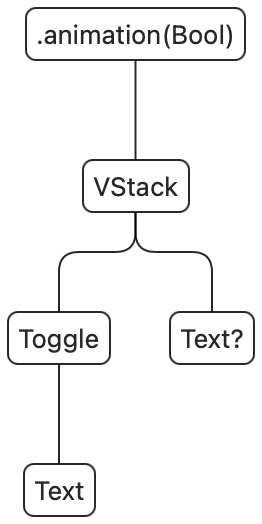
To build up a mental model of what's happening, we can consider the SwiftUI view tree for the above view:
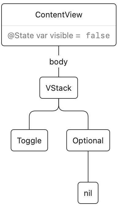
SwiftUI views are ephemeral: the body of ContentView gets executed and from it a render tree is created. This render tree is persistent across view updates, and it represents the actual views on screen. Once the render tree is updated, the value for body then goes away. Here's the render tree after the initial rendering:
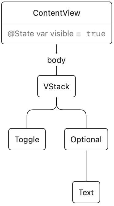
Once we tap the switch, a state change happens and the body of ContentView executes again. The existing render tree is then updated. In this case, SwiftUI noticed that the if condition changed from false to true, and it will insert our Text view into the render tree:
The change in the render tree is what triggers the transition. Transitions only animate when the current transaction contains an animation. In the example above, the .animation call causes the transition to animate.
The render tree does not actually exist with that name or form, but is simply a model for understanding how SwiftUI works. We're not completely sure how these things are represented under the hood.
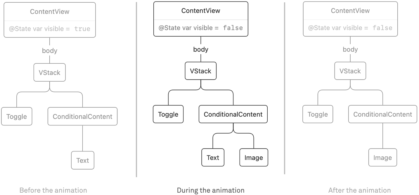
When we change our view to have an if/else condition, things get a bit more interesting. Here's the code:
When we render the initial view tree, it will contain a VStack with a Toggle and a Text. Once the state changes from false to true, the text is replaced by an image. In the ephemeral view tree there is always either the Text or the Image, never both. In the render tree however, during the animation the tree will contain both views:
Because we use the default transition, it looks like the text fades into the image and back. However, you can think of them as separate transitions: the text has a removal transition (fade out) and the image has an insertion transition (fade in).
We are not limited to the default fade transition. For example, here is a transition that slides in from the leading edge when a view is inserted, and removes the view by scaling it down:
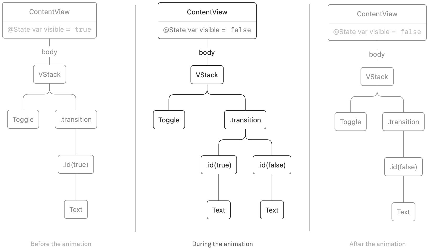
Note that in the sample above, we used a visible value to switch between the two Texts, even though they are the same. We can simplify the code a bit by using id(_:). Whenever the value we pass to id changes, SwiftUI considers this to be a new view in the render tree. When we combine this with our knowledge of transitions, we can trigger a transition just by changing the id of a view. For example, we can rewrite the sample above:
Before the animation, the text is present, and during the animation the newly inserted view (with id(false)) is transitioned in, and the old view (with id(true)) is transitioned out. In other words: both views are present during the animation:
When the builtin transitions don't cover your needs, you can also create custom transitions. There is the .modifier(active:identity) transition. When a view isn't transitioning, the identity modifier is applied. When a view is removed, the animation interpolates in between the identity modifier and the active modifier before removing the view completely. Likewise, when a view is inserted it starts out with the active modifier at the start of the animation, and ends with the identity modifier at the end of the animation.
Here's an example of a favorite button with a custom transition. This isn't a perfect implementation (we would not hardcode the offsets and width of the button) but it does show what's possible:
Sometimes when performing a transition you might see unexpected side-effects. In our case we were almost always able to resolve these by wrapping the view we're transitioning inside a container (for example, a VStack or ZStack). This adds some "stability" to the view tree that can help prevent glitches.
In essence, transitions aren't very complicated. However, achieving the result you want can be a bit tricky sometimes. In order to effectively work with transitions you have to understand the difference between the view tree and the render tree. And when you want to have custom transitions, you also need to understand how animations work. We cover this in both our workshops and our book Thinking in SwiftUI.
If your company is interested in a workshop on SwiftUI, do get in touch.
One of the modifiers that always puzzled me a bit was .aspectRatio. How does it really work? Once I figured it out, it turned out to be simpler than I thought.
One place where we can find out a lot about how SwiftUI works is SwiftUI's .swiftinterface file. This is located inside of Xcode. Inside your Terminal, go to /Applications/Xcode.app, and perform the following command:
The variant with CGSize just calls this method with size.width/size.height, and .scaledToFit and .scaledToFill call this method with the respective content modes and an aspectRatio of nil.
When we call aspectRatio with a fixed aspect ratio, e.g. .aspectRatio(16/9, contentMode: .fit), the aspect ratio implementation takes the proposed size, and proposes a new size to its child. When the content mode is .fit, it fits a rectangle with the desired aspect ratio inside the proposed size. For example, when you propose 100×100, it will propose 100×56.2 to its child. When you choose .fill instead, it will propose 177.8×100 to its child instead.
I figured out this behavior by printing the proposed sizes. More on that below.
Perhaps the most common use of aspectRatio is combined with a resizable image, like so:
This will draw the image to fit within the proposed size. Note that we do not specify the actual aspect ratio: it is derived from the underlying image.
When we don't specify a fixed aspect ratio but use nil for the parameter, the aspect ratio modifier looks at the ideal size of the underlying view. This means it simply proposes nil×nil to the underlying view, and uses the result of that to determine the aspect ratio. For example, when the image reports its ideal size as 100×50, the computed aspect ratio is 100/50.
The process then continues like before: when the view was proposed 320×480, the image will be sized to 320×160 when the content mode is set to .fit, and 960×480 when the content mode is set to .fill.
Figuring out proposed sizes
Proposed sizes are not part of the public API of SwiftUI. Even though you absolutely need to understand how this works in order to write effective layouts, this isn't really documented. The only official place where this behavior is described is in the excellent 2019 WWDC talk Building Custom Views with SwiftUI.
However, there is a hack to do this. Inside the interface file mentioned above, I searched for "ProposedSize" and found a protocol named _ArchivableView which allows us to override sizeThatFits:
We can now simply construct a MySample with an aspect ratio and print the result. Instead of a .frame, you can also use .fixedSize() to propose nil for the width and/or height. Likewise, try leaving out the first parameter and see how .aspectRatio proposes nil to figure out the ideal size of its child view.
Unfortunately the width and height properties on _ProposedSize aren't visible in the swift interface, so I had to use introspection to print those (and also add a few helper methods like .pretty and .orDefault). The full code is in a gist.
If you want to learn more about how SwiftUI works, read our book Thinking in SwiftUI. When your company is already building things in SwiftUI — or is about to get started — consider booking a SwiftUI Workshop for your team.