Watching the WWDC presentation of the new version of iOS, we were looking at our app Grocery List and realized: This iOS version is a complete restart, like the first introduction of the iPhone seven years ago. It's not enough to simply change the design. We had to rethink and rebuild the application to fit within the new environment. So we did.
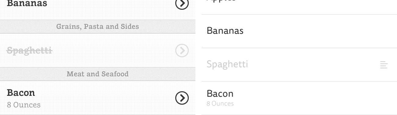
While the basic behavior of an app should not be changed, we decided to do so based on user feedback and our own usage that made us realize we had to improve some workflows. As an example, in the old application, adding an amount and unit to a product is a multi-step process that requires navigating through multiple controllers. In Grocery List 2, you will be able to set the values in place without leaving the current screen.
On our way to achieving this, we encountered some topics that we thought would be useful to share. We'll start with animations and gestures. After that, we'll take a look at the interface, the colors, and the fonts. To attract the user to open our app, we'll have a look on how to design an iOS 7 app icon. Finally, we will share with you our opinion on what the new update means.
Animations
Current mobile devices are becoming more powerful with each iteration. Meanwhile, the animations of objects are increasingly more realistic due to the ability to calculate the physical constraints in real time. There is no longer a need to apply shadows and gradients to your interface. Instead, you could focus on the feel, the motion, and the impact of your interactions. You can create a new world with the same rules but without simulating the old one.
The new SDK allows you to easily create and use custom animations. Before iOS 7 changing the transition from one view controller to another required lots of extra work. The possibility to easily add your own animation helps the user keep his or her path through different screens without losing focus.
In Grocery List, we use a slightly modified transition to display a modal controller. But most of the animations and transitions are default. With Grocery List 2 and the new APIs, we could have added more custom animations as before. But Apple's solution to handle transitions is a good fit to most of our problems. That's why navigating through controllers in our app behaves the same as default apps do. As mentioned before, some of our app's workflows have significantly changed. As a result, we will also use custom animations to support the user better keeping focus.
The default animations on iOS 7 will feel new and natural to most of the users, and you don't have to do much to use them and to make your users happy. But adding some custom animations in places where they fit in will improve the overall experience of your app. Just be careful not to overdo it.
Gestures
After several years of experience with touch devices, Apple discovered that the wider use of gestures is becoming more natural to users. In iOS 7, there are now a lot more possibilities to do so than before. Newly integrated ones, like swiping on a table view cell to reveal a hidden menu or swiping from the left edge to go back to the previous controller, have become so familiar in no time at all that you would miss them if an app didn't support them. The benefit of the direct manipulation in place helps the user to finish his task more efficiently without losing focus.
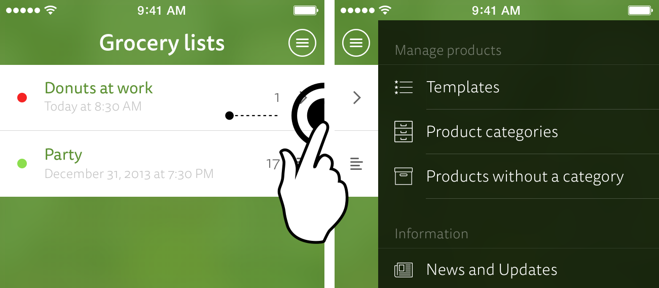
In Grocery List, we didn't have any custom gestures. But for our goal to improve some workflows in the next version, we support swiping on a cell from both directions to present different options for a product. And instead of having to go back your navigation stack to get to your lists or templates, you can easily swipe from the right device edge to quickly access the menu.
Buttons and links are visible and recognizable for the user but gestures are not. If you're planning to support your features with gestures, great! But if some features in your app rely on gestures and don't have an equivalent and visible control, always provide a good way to discover them. An interface always should be self-explanatory. If you need introduction screens or videos to describe the basic features of your app, you might be doing something wrong.
Interface
Probably the most-discussed topic before the final iOS 7 presentation has been the difference between flat and skeuomorphic design. iOS 7 has completely removed all real-world dependency from its design but has mostly maintained its well-known interaction model. The new, thin toolbars icons help the content to stand out. But keep in mind, they also easily fail to be identified and to be self-explanatory - especially when there is no label to describe the action the icon triggers.
We discovered it isn't all about recreating or removing all appearances of real objects, but rather it's important to support the content in the best way. If adding a subtle shadow to your navigation bar helps your app's content to stand out, there is no need to avoid it. The most important thing is to increase contrast where it is necessary and to present your content in a usable way.
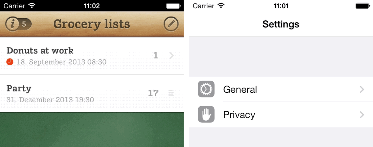
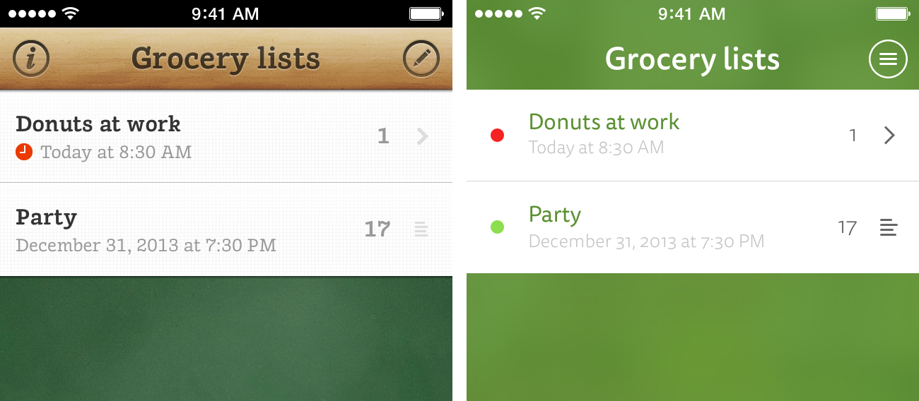
Grocery List depends heavily on its closeness to the real world. Chalkboard as background, cells like paper, all framed by glossy wood. As nice as it looks, it is a challenging task to place controls you can interact with and to add new features which have to fit within its narrow context. With iOS 7 and its cleaner design, we don't have to be super realistic but can instead focus on improving the interaction to let the user achieve his or her goal. Grocery List 2 will definitely be using the new design language but trying to keeping its own style.
After using iOS 7 on a device for a few weeks, interacting with it seems more convenient then it was with previous versions. The new animations and gestures, and the abstinence of skeuomorphic elements, allow the user to better focus on the content.
Colors
The main difference between iOS 6 and iOS 7 is the overall feeling of color. Apple has made the transition from a dark appearance to a bright one. The colors are getting more vibrant and saturated to support the more frequently used transparency and background blur.
Due to the skeuomorphic approach of Grocery List, colors could not be adjusted heavily. They were primary defined by the materials that we wanted to imitate. While we like the friendlier look of iOS 7, most build-in apps are mainly white. In Grocery List 2, the app will primarily be defined by its color scheme that also fits in the grocery scope. We don't want our app to be seen as just another iOS 7 app; instead we are trying to create a unique appearance.
Colors affect the perception of your app. Don't let your app be all white like the build-in ones. Instead, create your own unique identity. With the clean and new design of iOS 7 and the lack of skeuomorphic elements, you can now use colors that pop to represent what you want to achieve with your app.
Fonts
Apple acknowledges the importance of type, as we see in the rewrite of the text system that has taken place in the new version. Labels and text fields now directly rely on the power of core text providing all typographic features a font has included. Ligatures, swooshes, and the like can be easily enabled by using the new Framework. And by getting your font object with text styles, your app will be able to display content at font sizes the user has chosen. For detailed information, have a look at this great article about fonts in iOS 7.
Due to the lack of "real" buttons and less chrome around text, text is getting more attention. Criticized from typographic experts for the overall use of the thin weight of Helvetica Neue in the early beta builds, Apple finally switched back to a more readable font weight.
In Grocery List, we use a slab-serif that matches the skeuomorphic style. Running the app on an iOS 7 device has shown that this font is not the best choice for the next version. We decided to use a custom, sans-serif font that could better support the overall appearance of our app than the default one could.
As content is the fundament of apps, it is important to enhance its legibility and the key to good legibility is good typography. Although Apple's default font, Helvetica Neue, is a good choice for most use cases, it is worth considering using a custom font - especially when your app presents lots of text.
App Icon
Not only has Apple changed the dimensions and outlines of the app icons in iOS 7, it has also changed the visual mood. App icons don't have an applied glow anymore, and most of the build-in app icons fit in the grid Apple has shown. Also, the icons are much simpler, removing the realistic effects and mostly only displaying simple symbolics on a colorful background. This is a transition away from little photorealistic illustrations toward the basic meaning of what an icon should be: Iconographic.
From a skeuomorphic app icon with chalkboard and wood to a simple, colorful icon with a coherent symbol, the Grocery List app icon does not really fit into the new homescreen. For the next version, we simplified the icon to a shopping basket symbol and chose a background color that we can also use as a main color in the app. This combination helps make the icon pop.
![]()
With iOS 7, icons will automatically be scaled to fit the new dimensions and result in blurry images. Shadows and lighting might look weird due to the new super-ellipse outline that iOS 7 uses to mask your icon. If you don't plan to update your app to adopt the new iOS 7 style, you should at least update it to add the new icon sizes.
Conclusion
While the whole look and feel of iOS 7 seems to be new and polished, the concept of navigating through an app is still the same as in the first iteration of iOS. Viewing data in lists and tables, pushing view controllers to navigate further, and receiving push notifications have become so familiar to the user that the change of colors and fonts and the removal of skeuomorphic elements does not interrupt the well-known flow.
Though Apple doesn't force you to change your application in this sense, we recommend to always try to improve it and keep the user in mind.