Building a Form Library
Over the last few weeks we have completed a series of ten Swift Talk episodes following the process of building a declarative form library.
For those who haven't been following along, we'd like to take this opportunity to revisit our original design goals and give you an idea of what this library is already capable of.
When we started to build the library, we had two major design goals in mind:
-
Forms should be written with a fully declarative syntax.
-
The library should synchronise the underlying data with the form's UI automatically — a difficult task!
When using forms, we often have to update multiple UI elements in response to a change in the underlying data. This personal hotspot form is an easily recognised example:
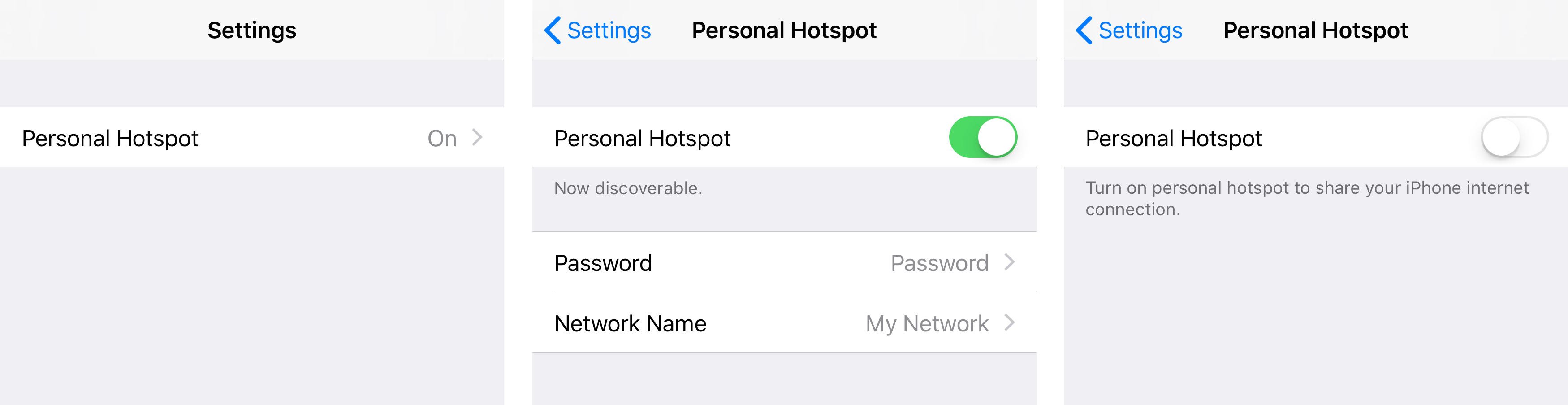
Switching the hotspot on or off has a number of effects:
-
It changes the personal hotspot status label on the main settings screen.
-
It changes the section footer below the switch.
-
It shows or hides the section containing the "Network Name" and "Password" fields.
Writing this logic by hand quickly becomes messy, and risks introducing errors.
To create this form with our library, we start by defining the underlying data structures:
								struct Settings {
    var hotspot = Hotspot()

    var hotspotEnabled: String {
        return hotspot.isEnabled ? "On" : "Off"
    }
}

struct Hotspot {
    var isEnabled: Bool = true
    var password: String = "Password"
    var networkName: String = "My Network"
}
Now we specify the form's UI using a declarative API that uses Swift's key paths to bind the UI to the data. The hotspot screen is defined like this:
								let hotspotForm: Form<Hotspot> =
    sections([
        section([
            controlCell(title: "Personal Hotspot", control: uiSwitch(keyPath: \.isEnabled))
        ], footer: \.enabledSectionTitle),
        section([
            nestedTextField(title: "Password", keyPath: \.password),
            nestedTextField(title: "Network Name", keyPath: \.networkName)
        ], isVisible: \.isEnabled)
    ])
The switch is bound to the isEnabled property, and the section footer below the switch is bound to the computed enabledSectionTitle property, which allows us to make the footer dependent on the hotspot's enabled state. Furthermore, the whole second section is shown or hidden by binding its visibility to the isEnabled property.
The main settings form embeds the hotspot settings like this:
								let settingsForm: Form<Settings> =
    sections([
        section([
            detailTextCell(title: "Personal Hotspot", keyPath: \.hotspotEnabled, form: bind(form: hotspotForm, to: \.hotspot))
        ])
    ])
The supplementary label on the right-hand side is bound to the computed hotspotEnabled property, signalling the hotspot's current state on the main screen without having to navigate into the hotspot settings screen.
If you'd like to learn more about this approach, check out the Building a Form Library Swift Talk series — the first three and the last two episodes are publicly available.
The complete series is available for subscribers.
