Introduction
Developing a mobile application is a creative process. You want to build something beautiful and functional. Something that works well on any device. Something that delights your users. Something that you’re proud of. I want to show you how I develop these kinds of applications on Android.
One common misconception about Android development is that it’s hard to write these kinds of applications when screen properties vary so widely. You’ve no doubt seen Android Fragmentation Visualized, which lists a daunting number of Android devices.
The truth is, you will have to put some thought into the design, but not significantly more than you would on other platforms. Android developers have excellent tools available to support this variation in device configuration and to ensure that their applications perform beautifully on all devices.
In this article, I will focus on three areas of variability in Android devices and how those variations affect the development and design of Android applications. I will cover these areas at a high level and from an iOS developer’s perspective:
-
How do Android developers optimize for minor variations in screen sizes? How are differences in width and height between devices managed?
-
How do Android developers account for screen density variations?
-
How are applications optimized to work well on different device categories? How can I make one app that works well on phone and tablet devices?
Screen Size
Let’s review screen sizes on iOS. There are effectively three: 3.5-inch iPhone, 4-inch iPhone, and iPad. Although the iPad mini is, of course, smaller than the iPad, from the developer’s perspective, it is simply scaled. For many applications, the 3.5-inch versus 4-inch iPhone screen size variance has little impact, since only the height changes.
The iOS drawing system uses points and not pixels, so the screen’s retina or non-retina status does not impact layout. Layout is either static (designed down to the point for each device, programmatically, or using device-specific XIB files) or dynamic (using Auto Layout or autoresizing masks).
In contrast, on Android, there are orders of a magnitude of more screen sizes that we must support. How can an Android developer possibly ensure that his or her app looks good on all of those devices?
In many ways, design for Android is similar to design for the web. Web designs must support any possible browser size. In the same way, Android designs are best built to anticipate changes in screen size. We design our views so that they will flow to fill the space and content that they are given.
Since you must design your application with different screen sizes in mind, supporting devices in landscape comes naturally. When an application is designed to support any screen size, landscape orientation is really just a wider configuration of your device.
Layout Files
Let’s dive in to the layout system in more detail. Layout files are XML files that describe your user interface.
We create a sample layout file below. This file is used as the view for a login screen in our application:
								<?xml version="1.0" encoding="utf-8"?>
<LinearLayout xmlns:android="http://schemas.android.com/apk/res/android"
              android:orientation="vertical"
              android:layout_width="match_parent"
              android:layout_height="match_parent"
              android:padding="14dp">
    <EditText
        android:layout_width="match_parent"
        android:layout_height="wrap_content"
        android:hint="username"/>
    <EditText
        android:layout_width="match_parent"
        android:layout_height="wrap_content"
        android:hint="password"/>
    <Button
        android:layout_width="match_parent"
        android:layout_height="wrap_content"
        android:hint="Login"/>
</LinearLayout>
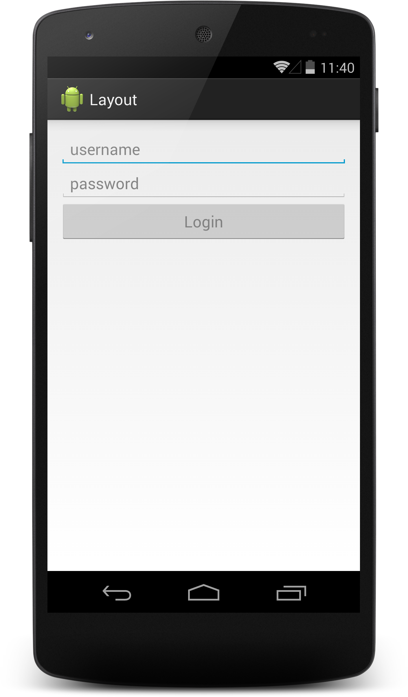
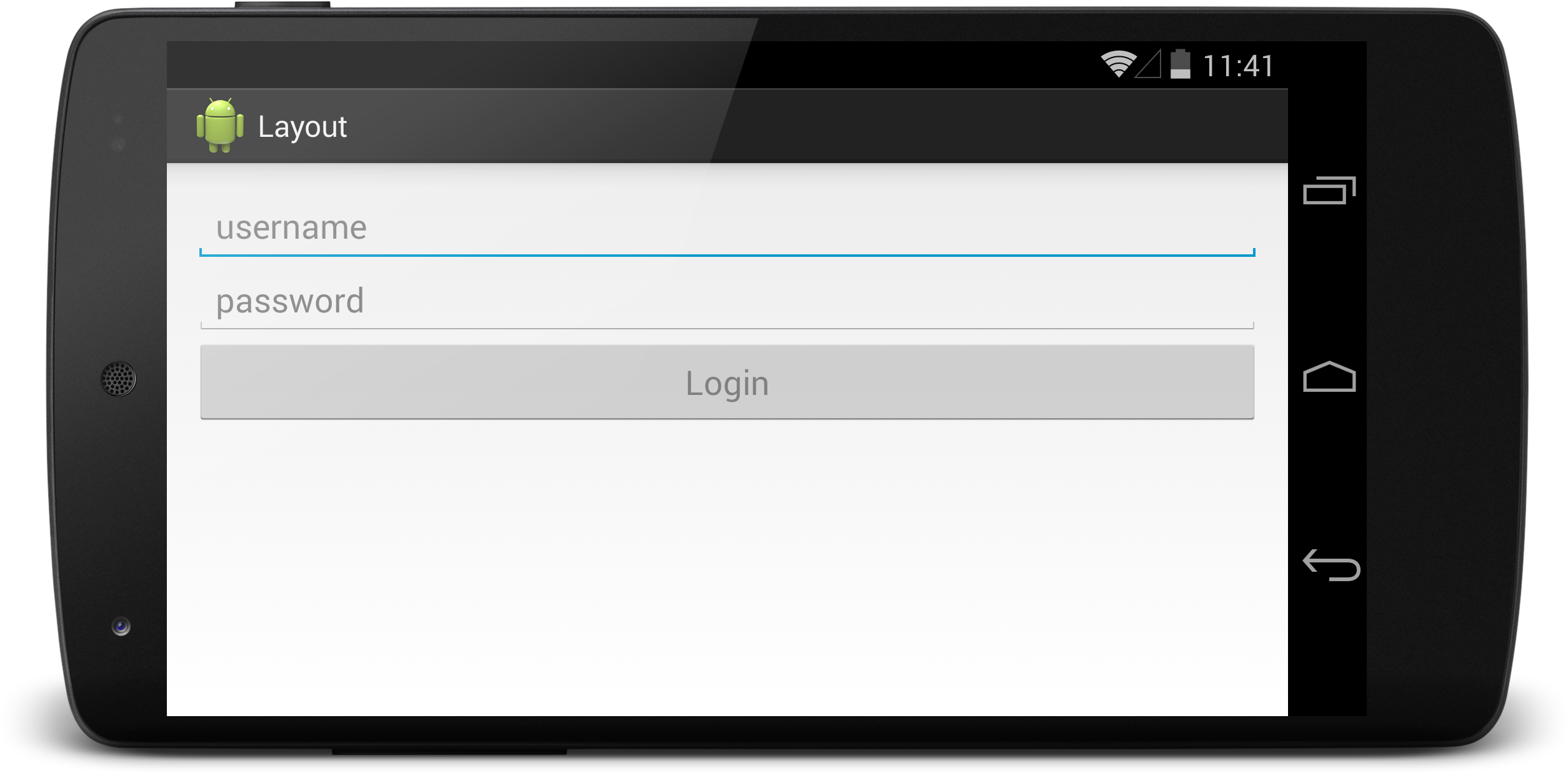
In the above layout file, LinearLayout has been used to align Views linearly. We’ve specified three views in the LinearLayout: a username EditText, a password EditText, and a login button.
Notice the layout_width and layout_height attributes on each view in the layout file. These attributes are used to specify the width and height of a view. We used two constants in each of these parameters: wrap_content and match_parent. If wrap_content is specified as the height of a view, that view will be exactly as tall as it needs to be to display its contents. If a view specifies match_parent as its width attribute, that view will be as wide as the view that contains it.
By making use of the wrap_content and match_parent values, we have designed a view that stretches to fill any screen size.
The most important distinction here from iOS is that this layout XML file and the views specified inside of it do not have a size. In fact, the views in this layout file will not have any size value associated with them until just before they are placed on the screen.
Screen Density
Another aspect of variability in Views on Android is screen density. How do you write an app that works on any density screen?
As you know, iOS developers are concerned with two sizes: normal and retina. If the @2x suffix on the filename is used, the system will automatically choose the appropriate image, depending on the device.
Android screen density works in a similar way but with more variability. Rather than two image buckets, Android developers have many. Our standard image bucket size is mdpi, or medium dpi. This mdpi bucket is the same as iOS’s normal image size. Then, hdpi, or high dpi, is 1.5 times the size of mdpi. Finally, xhdpi, or extra high dpi, is 2 times the normal size, the same as iOS’s retina size. Android developers can take advantage of other image buckets, including xxhdpi and xxxhdpi.
Resource Qualifiers
The addition of many buckets may seem overwhelming, but Android makes use of a robust resource qualification system to specify how a particular resource can be used.
Below, you see an example of resource qualifiers for images. In an Android project, we have a res folder, which is where we store any resources that the app is going to use. This includes images, but also our layout files, as well as a few other project resources.
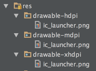
Here, ic_launcher.png is duplicated in the following three folders: drawable-hdpi, drawable-mdpi, and drawable-xhdpi. We can ask for the image named ic_launcher and the system will automatically choose the appropriate image at runtime, depending on the device configuration.
This allows us to optimize these images for multiple screen sizes but can be somewhat wasteful since the image will be duplicated multiple times.
These screen density buckets are fuzzy qualifiers. If you’re using a device with an xxhdpi screen in the example above, the system will automatically choose the xhdpi version of the image and scale the image for your screen density. This feature allows us to create one version of our images and optimize them for other screen densities as needed.
A common pattern is to supply a high density image and allow Android to downscale that image for devices with a lower screen density.
DIPs
One final adjustment to consider for screen density variation is specification of exact dimensions in your layout files. Imagine that you want to supply padding to the outside of a screen in your app. How can we specify dimension values that also scale relative to the device’s screen density?
Well, iOS developers would specify this padding in point values. On a non-retina device, the raw pixel value would be used, and on retina devices, the system will automatically double that pixel size.
On Android, you can specify this padding in raw pixel values as well, but those values will not scale on devices with high-density screens. Instead, Android developers specify dimension units in density-independent pixels (typically called dip, or dp units). These units will scale relative to the device's density in the same way that iOS automatically performs the scaling.
Device Category
A final detail to consider is how device categories are managed on Android. Note that iOS has two distinct categories: iPhone and iPad. However, Android is very different, as it has a spectrum of device categories, and the distinction between a phone and tablet can be arbitrary. The resource qualification system mentioned earlier is used heavily to support this spectrum of screen sizes.
For simple screens, padding can be adjusted around content, based on the size of the device. For example, let’s examine dimension resources. We can define a dimension value in a common location and reference it in our layout files:
								<?xml version="1.0" encoding="utf-8"?>
<LinearLayout xmlns:android="http://schemas.android.com/apk/res/android"
    android:layout_width="match_parent"
    android:layout_height="match_parent"
    android:layout_margin="@dimen/container_margin" >
    ...
</LinearLayout>
Notice the @dimen/container_margin value. This refers to a named value stored in the resources system. We can define a base margin-dimension value that is used by default:
In res/values/dimens.xml:
								<resouces>
    <dimen name=”container_margin”>4dp</dimen>
</resources>
Then, we create a qualified version of this padding for tablets:
In res/values-w600dp/dimens.xml:
								<resouces>
   <dimen name=”container_margin”>96dp</dimen>
</resources>
Now, on devices that have a minimum width of 600 dp units, the larger container margin value will be selected by the system. This additional margin will tweak our user interface so that the app is not just a stretched-out version of the application that looks great on phones.
Split Views
The above dimension example is a useful tool for some situations, but it is often the case that an application will become more useful on a tablet because there is more space for additional application components.
A common pattern in universal iOS applications is the use of a split view controller. UISplitViewController allows you to host two view controllers that would typically each be visible by themselves in a single screen of your app on an iPad.
On Android, we have a similar system, but with more control and additional options for expansion. Core pieces of your application can be abstracted into reusable components called fragments, which are similar to view controllers in iOS. All of the controller logic for a single screen of your application can be specified in a fragment. When on a phone, we present one fragment to the user. When on a tablet, we can present two (or more) fragments to the user.
We can rely again on the resource qualification system to supply a distinct layout file for phones and tablets, which will allow us to host two fragments on a tablet and one on a phone.
For example, the layout file defined below is intended to be used on phone devices:
In res/layout/activity_home.xml:
								<?xml version="1.0" encoding="utf-8"?>
<FrameLayout xmlns:android="http://schemas.android.com/apk/res/android"
    android:id="@+id/container"
    android:layout_width="match_parent"
    android:layout_height="match_parent" />
This FrameLayout defined by the container ID will contain the master view for our application and will host the view for our master fragment.
We can create a qualified version of this same file for tablet devices:
In res/layout-sw600dp/activity_home.xml:
								<?xml version="1.0" encoding="utf-8"?>
<LinearLayout xmlns:android="http://schemas.android.com/apk/res/android"
    android:orientation="horizontal"
    android:layout_width="match_parent"
    android:layout_height="match_parent">
        <FrameLayout
        android:id="@+id/container"
        android:layout_width="250dp"
        android:layout_height="match_parent" />
        <FrameLayout
        android:id="@+id/detail_container"
        android:layout_weight="1"
        android:layout_width="0dp"
        android:layout_height="match_parent" />
    </LinearLayout>
Now, when we use the activity_home layout file on a tablet, we will have two panes in our layout instead of one, which means we can host two fragment views. We can now display the master and the detail view in the same screen with very little code modification. At runtime, the system will decide which version of the layout file to use based on the configuration of the device.
Conclusion
With the exception of the sw600dp resource qualifier, all of the tools in this article are available on any Android device that you would support. There is an older and less granular resource qualifier that existed prior to the addition of sw600dp, available for those older devices.
As described above, Android developers have the tools needed to optimize for any type of device. You will see some Android applications that don’t adapt very well to many devices (I wouldn’t call this uncommon). I want to stress that shoehorning a design from an existing platform just won’t work on Android. I challenge you to rethink your design and provide a delightful experience for your users.