A Signal Strength Indicator
In the second of our Thinking in SwiftUI challenges, we asked you to build a signal strength indicator with a flexible width and height, without using GeometryReader, that should fill the space proposed by SwiftUI's layout system:
SwiftUI Challenge #2
— objc.io (@objcio) February 12, 2020
This week's challenge: build a signal strength indicator.
Watch the video, then reply with your nicest solution — we'll post ours next Tuesday!
Some starter code: https://t.co/i42qPyjxOv pic.twitter.com/FNkW89J7Bd
In this article, we'll discuss our solution.
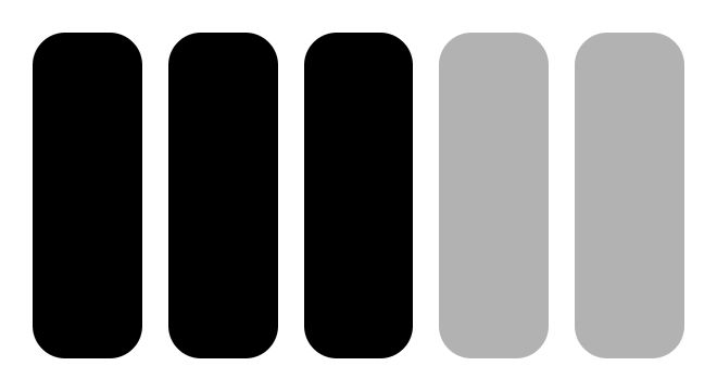
As a first step, we can draw five rounded rectangles that are filled with the primary color, and have their opacity based on whether they're "active" bars or not:
								struct SignalStrengthIndicator: View {
    var bars: Int = 3
    var totalBars: Int = 5
    var body: some View {
        HStack {
            ForEach(0..<totalBars) { bar in
                RoundedRectangle(cornerRadius: 10)
                    .fill(Color.primary.opacity(bar < self.bars ? 1 : 0.3))
            }
        }
    }
}
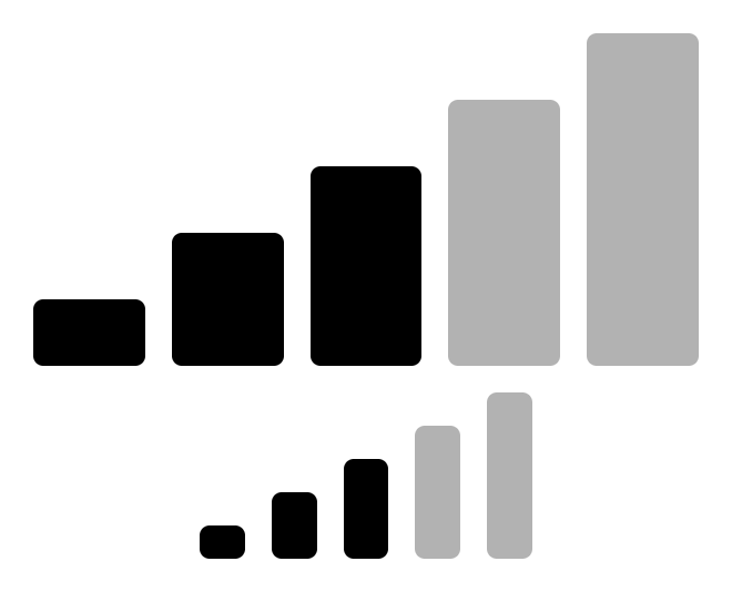
As the second step, we need to scale the rounded rectangles vertically. We could use .scaleEffect, but that scales the rendered view and distorts the rounded corners. Ideally, we would propose a different frame to the rectangles. To do this, we can use the Shape protocol, which consists of a single requirement: the conforming type needs to implement a method that draws a Path given a proposed rectangle.
We'll create a Divided struct that conforms to the Shape protocol, so it'll receive the proposed rectangle. It then divides the proposed rectangle and proposes that to its child shape:
								struct Divided<S: Shape>: Shape {
    var amount: CGFloat // Should be in range 0...1
    var shape: S
    func path(in rect: CGRect) -> Path {
        shape.path(in: rect.divided(atDistance: amount * rect.height, from: .maxYEdge).slice)
    }
}
To make the code a little more readable, we add an extension on Shape:
								extension Shape {
    func divided(amount: CGFloat) -> Divided<Self> {
        return Divided(amount: amount, shape: self)
    }
}
Now we can use the divided method to change the implementation of SignalStrengthIndicator:
								struct SignalStrengthIndicator: View {
    var bars: Int = 3
    var totalBars: Int = 5
    var body: some View {
        HStack {
            ForEach(0..<totalBars) { bar in
                RoundedRectangle(cornerRadius: 3)
                    .divided(amount: (CGFloat(bar) + 1) / CGFloat(self.totalBars))
                    .fill(Color.primary.opacity(bar < self.bars ? 1 : 0.3))
            }
        }
    }
}
Here's the same signal strength indicator rendered with a frame of (200, 100) and (100, 50):
There are a few obvious improvements you could make, which we'll leave as an exercise for the reader: the Divided struct could take the edge as a parameter, the rounded rectangle could have a corner radius that's dependent on the proposed size, and the HStack could have spacing that's dependent on the proposed size.
Making The View Scale With Text
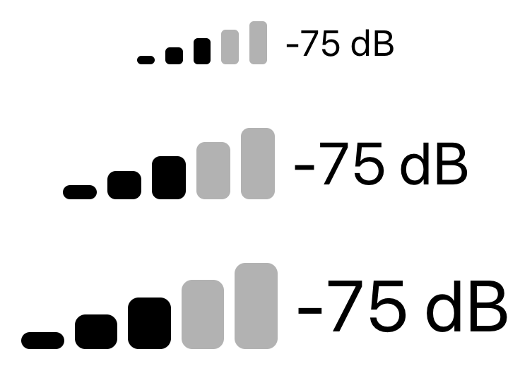
To make our view scale with text, we could try to read the current font from the environment, but that won't give us access to the point size. Fortunately, there's this one weird trick we could use: take some fixed text, hide it, and add our signal strength indicator as an overlay. The overlay will receive the size of the rendered text as its proposed size, and fill up that space exactly:
								struct SignalStrengthView: View {
    var body: some View {
        HStack {
            Text("NNNNN").hidden().overlay(SignalStrengthIndicator())
            Text("-75 dB")
        }
    }
}
Here's what it looks like at different font sizes:
While we hope that newer versions of SwiftUI will make hacks like this unnecessary, it's a fun trick to have in your arsenal.
Our new book, Thinking in SwiftUI, discusses the layout system in more detail in chapter four and five. At the time of writing, the first three chapters are already available for early access readers, with a new chapter and Q&A video released every week until the book is complete.
You can join the early access here.
