SwiftUI Challenge #1
Last week, to coincide with the early access release of our latest book, Thinking in SwiftUI, we tweeted the first in a series of SwiftUI coding challenges.
SwiftUI Challenge!
— objc.io (@objcio) February 5, 2020
To celebrate our new book, Thinking in SwiftUI, we're posting weekly challenges.
Watch the video, then reply with your nicest solutions — we'll discuss them next Tuesday.
Here's some code to get you started: https://t.co/GnbJhvYV1a pic.twitter.com/86OQ54EpgT
We asked you to build a badge view, similar to the red badges used on the iOS Home screen. The badge should be positioned in the top-trailing corner of a view, show the current count, and disappear when the count becomes zero. As a bonus exercise, the badge should be animatable, scaling up and down when the count changes between zero and one.
In this post we'll show our solution, discuss why we chose it, and how you could approach the problem differently.
This is the code we ended up with:
								extension View {
    func badge(count: Int = 0) -> some View {
        ZStack(alignment: .topTrailing) {
            self
            ZStack {
                if count != 0 {
                    Text("\(count)")
                        .font(.footnote)
                        .frame(width: 24, height: 24)
                        .background(Circle().fill(Color.red))
                        .animation(nil)
                        .transition(.scale)
                }
            }
            .offset(x: 12, y: -12)
        }
    }
}
Let's go through this step by step: The outer ZStack is used to overlay the badge onto the view we want it to be applied to. We specify .topTrailing as alignment, so that the badge will already be aligned in the top-trailing corner. The inner ZStack serves as a wrapper around the if statement, so that we can apply an offset to the badge that's independent of the transition. The actual badge is implemented as a text label with a fixed frame and a red circle in the background.
For the bonus exercise, when the count changes between zero and one the scale animation is made possible by two lines of code: .transition(.scale) activates the scale transition on the badge when it gets inserted into or removed from the view hierarchy, and .animation(nil) makes sure that the text's frame doesn't animate when the digits change.
Why did we implement it this way, and what could we have done differently?
Instead of using the outer ZStack to position the badge on top of the view, we could have chosen an overlay. However, we would still need to align the badge in the top-trailing corner, which we could do by specifying an infinitely flexible frame (filling up the entire size of the overlay) with a .topTrailing alignment:
								func badge(count: Int = 0) -> some View {
    overlay(
        ZStack {
            // ...
        }
        .offset(x: 12, y: -12)
        .frame(maxWidth: .infinity, maxHeight: .infinity, alignment: .topTrailing)
    )
}
This would work, but it feels more complicated than using a ZStack.
Next, instead of using the if condition to take the badge off screen when it becomes zero, we could keep it in the view hierarchy and hide it with an opacity, or scale it down to zero size. This would allow us to remove the inner ZStack as well:
								Text("\(count)").font(.footnote)
    .frame(width: 24, height: 24)
    .background(Circle().fill(Color.red))
    .animation(nil)
    .opacity(count > 0 ? 1 : 0)
    .offset(x: 12, y: -12)
However, because the badge is never removed from the view hierarchy, this would prevent us from using a transition to animate the badge in and out. Instead, we could use a scale effect and specify the scale factor dependent on the current value of count:
								Text("\(max(1, count))").font(.footnote)
    .frame(width: 24, height: 24)
    .background(Circle().fill(Color.red))
    .animation(nil)
    .scaleEffect(count > 0 ? 1 : 0, anchor: .center)
    .offset(x: 12, y: -12)
Note that we also have to modify the label's text to prevent it from showing a zero before it disappears by scaling down. All in all we prefer using an if condition with a transition, especially since it feels cleaner to remove the badge entirely.
Lastly, instead of using .offset, we could have customized the badge's top and trailing alignment guides to move its center onto the top-trailing corner.
In place of:
								ZStack {
    // ...
}
.offset(x: 12, y: -12)
We could write:
								ZStack {
    // ...
}
.alignmentGuide(.top) { $0.height / 2 }
.alignmentGuide(.trailing) { $0.width / 2 }
This modifies the top and trailing alignment guides of the ZStack around the badge to be vertically and horizontally centered. The badge's center will now be aligned with the top-trailing corner of the underlying view.
This approach feels cleaner, since we don't need to use constants to offset the badge by exactly the right amount for its size. However, this changes the layout behavior of a view with a badge applied. If we put two views next to each other, one with a badge and the other without, the result is probably not what we want:
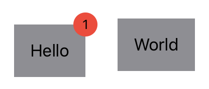
Modifying the alignment guides changes the size of the view the badge is applied to, whereas .offset just changes the position that the badge gets drawn (slightly out of bounds in our case):

In the replies to our tweet you can see some other solutions. As always, there's more than one way to meet a challenge.
Our new book, Thinking in SwiftUI, discusses the layout system in more detail in chapter four, and we cover animations in chapter six. At the time of writing, the first two chapters are already available for early access readers, with a new chapter and Q&A video released every week until the book is complete.
You can join the early access here.
